ux design · ui design · user research
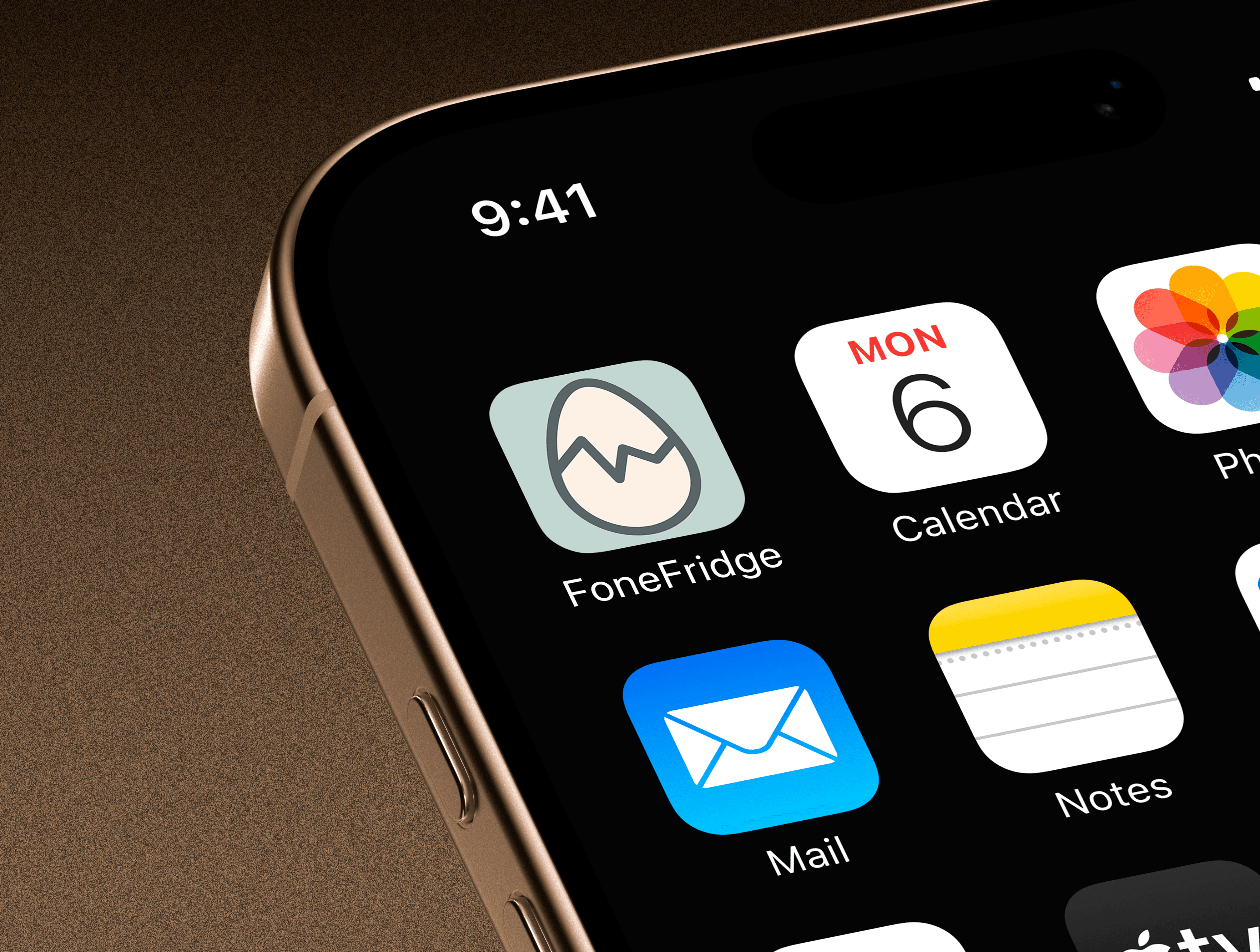
FoneFridge
Saving food, time, money.

The Problem
Food gets forgotten in the fridge and pantry, spoils, and gets thrown out. This cost adds up quietly over time, especially for people who aren’t cooking with a disciplined routine. On top of that, in the United States, 40% of food gets thrown away every year, and that sums up to $162 billion in waste annually.
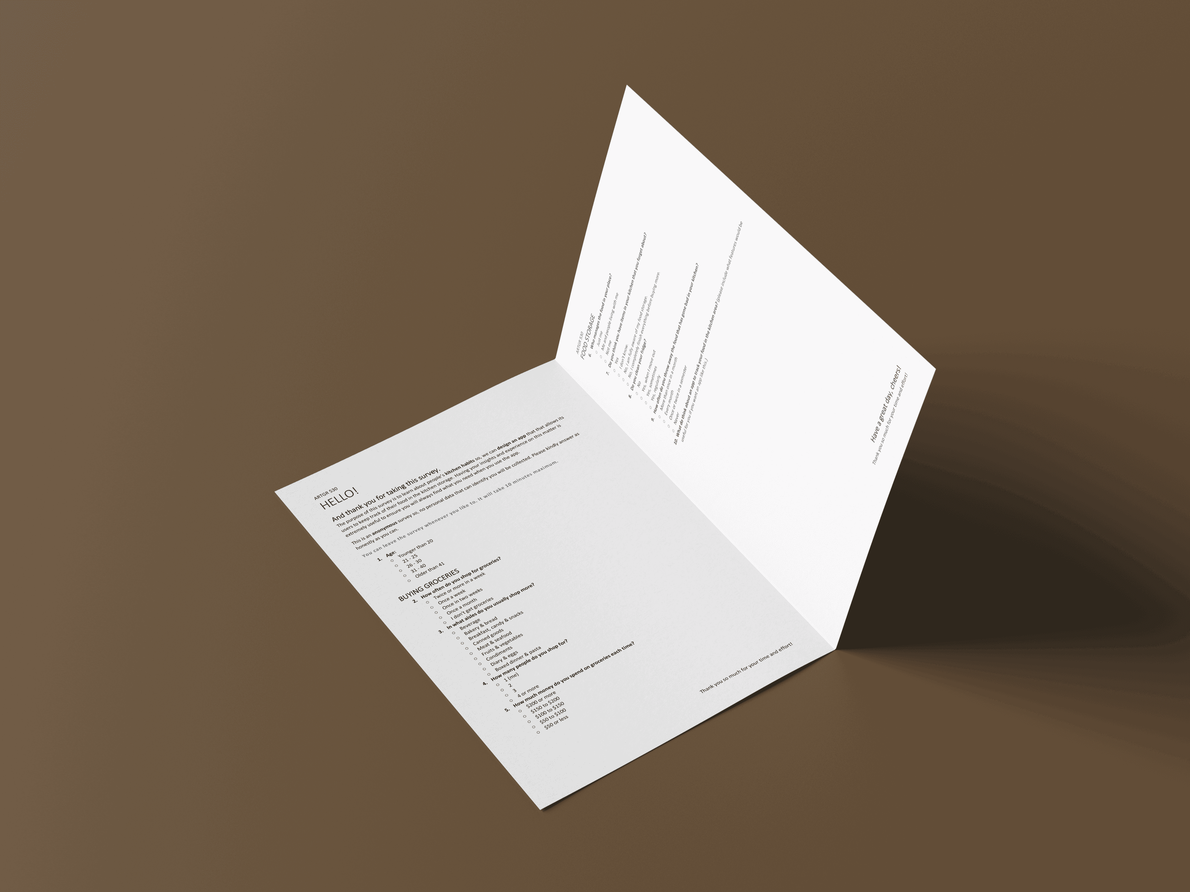
I validated this problem with a survey before designing anything, and it revealed that for anyone not cooking at home consistently, losing track of what’s actually in the fridge happens easily and often. The stakes are financial and also the mental load of one more thing to keep track of.


The Solution
Users scan barcodes for packaged items like boxed milk, or pick from a built-in library for general items like tomatoes. The library already knows typical spoilage timelines and alerts.
Alerts don’t just flag that something’s about to spoil; they suggest what to do about it, from a recipe to use it up to a disposal tip if it’s already gone.
The app doubles as a grocery list too. Marking an item “used” from an alert effectively adds it back to a running list of what’s out.


The Engagement Challenge
This was for an engagement-focused class, but food tracking isn’t a naturally engaging category. The goal was to bring attention to a genuinely forgotten part of users’ lives, at the right moment, without becoming another ignorable notification. The app alerts users as items approach their spoil date rather than on a generic schedule, so each notification is actually timely and worth acting on.
Visual Design
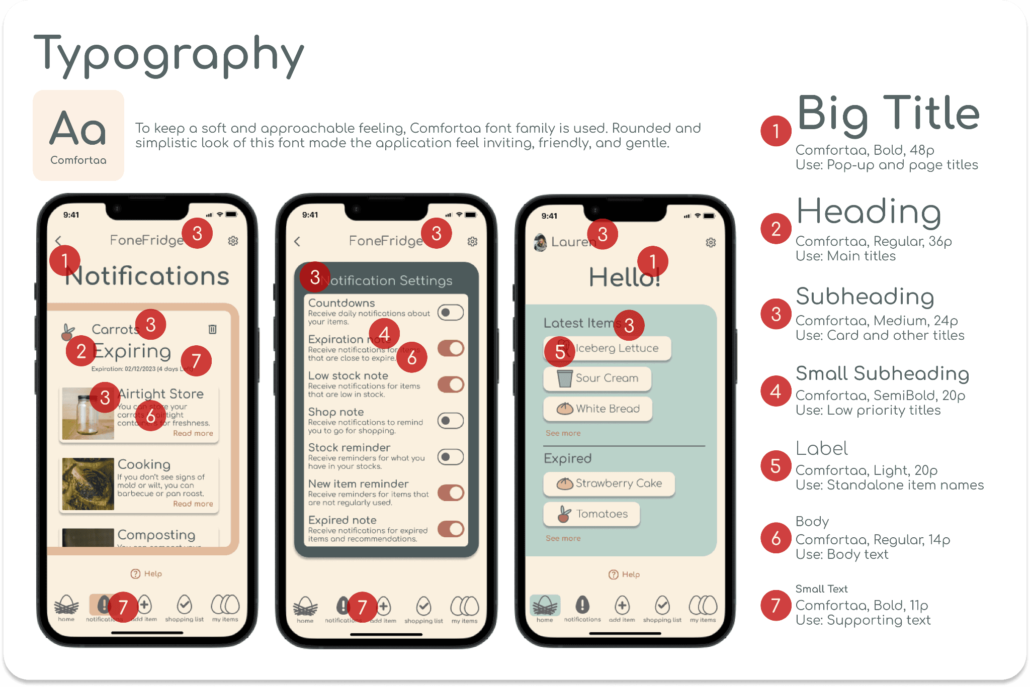
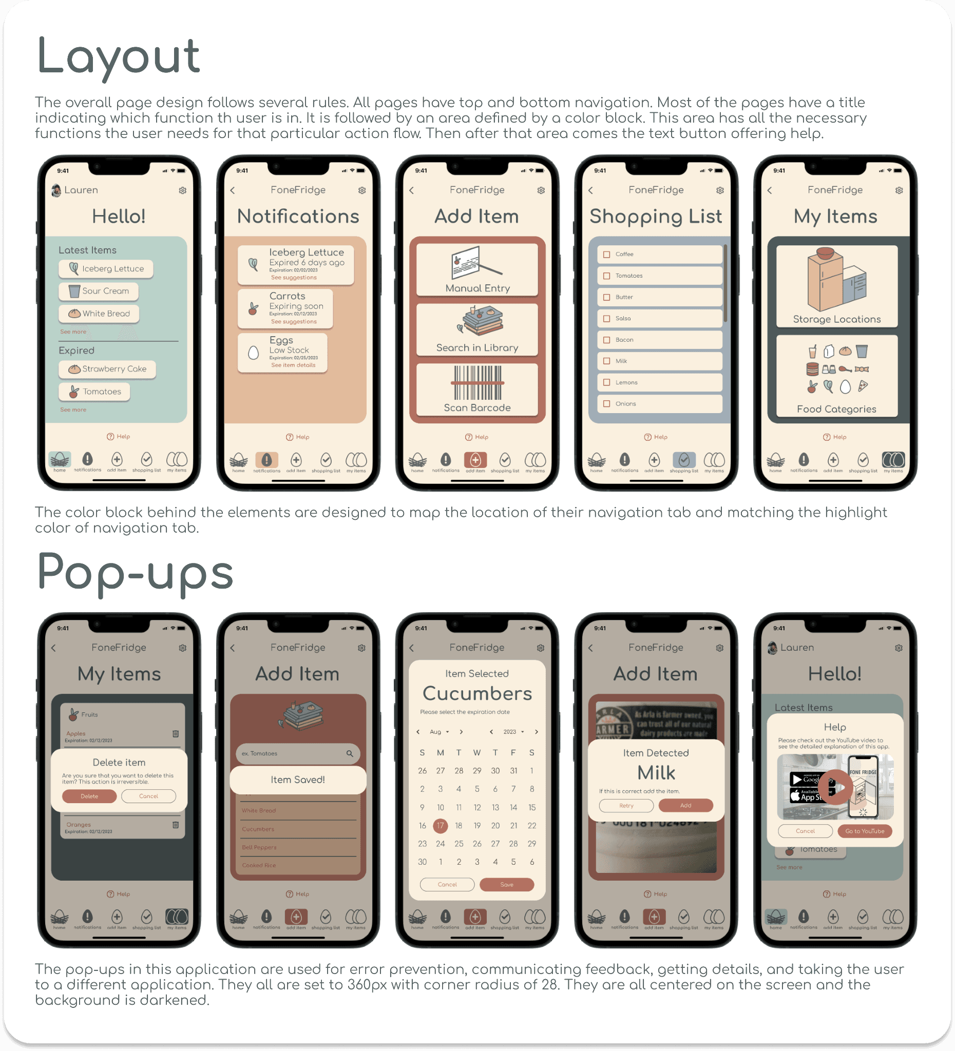
I used a pastel red and desaturated denim blue palette with fully rounded corners throughout, aiming for something fun and joyful, a deliberate contrast to how mundane the subject matter actually is.


Testing
Before usability testing, the class did two rounds of peer review using heuristics, scoring each other's designs. That feedback shaped changes ahead of testing with real users.
I then ran a usability test with 3 people against a set task list covering the app's core flows.
One mistake became its own useful finding: the task list I wrote used different wording than the actual copy inside the app, which visibly confused participants. It was a clear lesson in how much wording consistency matters for usability testing to give a clean signal, something I now account for deliberately.


Beyond the Design
After finishing the design, I took a Python course and built a desktop version of FoneFridge using Tkinter and Pandas as a coding exercise. My coding skills were limited, so the desktop build doesn’t have the same visual polish as the original mobile design.
Github


Let’s create together.
I’m open to new opportunities and collaborations. The fastest way to reach me is by email.
© 2026 Pınar Adanır. UX/UI Product Designer.
Designed & built with intention.